

Risk-based testing is the practice of deciding which parts of an application get automated test coverage by scoring how likely a feature is to fail against how bad it is when it does, then spending a limited coverage budget on the highest scores first. Done right, it doesn't just rank risk, it decides whether a test exists for an area at all. This piece gives the two-axis scoring model, a worked table across five areas of a typical B2B SaaS app, and the coverage cut line a constrained team actually draws.
Open any guide to risk-based testing and you'll find the same line: focus your limited testing time on the highest-risk parts of the app. Ranorex says it. mabl says it. Neither one tells you how to score risk in a way you could defend to a VP or an auditor. That's the actual gap. "High risk" is exactly the thing two engineers on the same team disagree about in a planning meeting, and "focus on it" is not a decision procedure.
This is written for QA leads, QA managers, and engineering managers who already own quality without a dedicated QA function, somewhere between Series A and Series C, with a real test suite and a real release cadence. If you have no tests yet and are trying to justify writing your first one, that's a different problem with a different answer. If your worry is whether your AI-generated suite actually asserts anything, that's also a different article. This one assumes you have coverage, you have more surface area than time to cover all of it, and someone just asked you to write down how you decide what gets tested.
What is risk-based testing? The two-axis model
Risk-based testing runs on two axes: how likely a part of the system is to fail, and how bad it is when it does. Score each independently, multiply the two numbers, and rank the result. Everything else is detail.
Risk score = likelihood (1-5) x blast radius (1-5). Checkout scores 5 x 5 = 25. Reporting scores 3 x 1 = 3. The worked table below runs the same math across five areas, and it produces very different coverage decisions.
How to score likelihood
Likelihood draws from signals most teams already have without adding a single new dashboard.
- Change frequency. How often that part of the codebase changes; more churn means more chances to introduce a regression.
- Historical defect density. How many defects it has produced before, one of the clearest signals your regression testing history can give you.
- Staleness. How long it's been since a human last exercised the full path end to end.
- Integration surface count. How many third-party APIs, queues, webhooks, payment processors, and auth providers it touches.
More change, more history, more staleness, more integrations, higher likelihood.
What is blast radius in testing?
Blast radius asks a different question: if this breaks right now, how bad is it.
- Revenue path. Does the path touch billing, checkout, or anything else that moves money.
- Data exposure. Does it expose or mutate customer data.
- Reach. How many tenants or user segments a failure touches, one customer's settings page or every customer's dashboard.
- Reversibility. A bad render is an inconvenience you fix and move on from; a wrong charge or a leaked record is not.
Multiplication is the mechanism, not decoration. Something that never breaks doesn't need coverage no matter how catastrophic the failure would be, and something that breaks constantly but harms nobody is a bug-tracker problem, not a test-strategy problem. Addition would let a merely annoying, frequent bug outscore a rare but severe one, the opposite of what a risk model is for.
One more discipline matters more than it looks: score the axes independently. Score all five areas on likelihood first, then go back and score all five on blast radius. Scoring one area on both dimensions at once produces a halo effect where the two numbers quietly agree, and a path that "feels risky" ends up high on both axes even when only one is actually true.
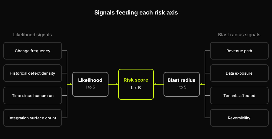
Each axis draws from four signals most teams already have. Likelihood comes from observable history, blast radius from estimated consequence, and the two multiply into one score.
Risk-based testing example: a worked scoring table
Here's the model applied to a shape most B2B SaaS teams will recognize: auth, checkout, settings, admin, and reporting, each scored on both axes with the resulting coverage allocation.
| Area | Likelihood (1-5) | Blast radius (1-5) | Risk score (L x B) | Coverage allocation |
|---|---|---|---|---|
| Checkout | 5 | 5 | 25 | Full E2E, happy path plus negative cases |
| Auth | 3 | 5 | 15 | Full E2E, happy path plus negative cases |
| Settings | 4 | 2 | 8 | Happy path plus top failure modes |
| Admin | 2 | 4 | 8 | Smoke-level assertion only |
| Reporting | 3 | 1 | 3 | Not covered this quarter, revisit next |
Checkout scores highest because both axes sit near the ceiling: it changes often (new discount logic, new payment methods, processor updates) and a failure is both revenue-bearing and largely irreversible. A declined charge that silently succeeds, or a successful charge the UI reports as failed, is the kind of bug that lands in the support queue within the hour.
Auth changes less often than checkout (moderate likelihood: it mostly moves when its external identity provider does), but its blast radius sits at the ceiling. Every user depends on it, and a failure that exposes one account's session to another isn't something you walk back with a patch note.
Settings and admin land on the identical risk score of 8, and that tie is the point of running a model instead of trusting your gut. Intuition says admin should outrank settings, it's the screen with the most power, so it feels the scariest. The numbers say otherwise. Admin changes rarely (low likelihood), while settings gets churned constantly by ordinary feature work (high likelihood). Admin's blast radius per incident is worse, since it can mutate many tenants' data at once, while settings stays contained to one tenant and is mostly reversible. Multiply either pair and you land in the same place. When two areas tie, break toward the axis backed by evidence, not judgment: likelihood is built from observable history, blast radius estimates a hypothetical. Prefer the higher likelihood score, since that number rests on something measured. That gives settings the deeper coverage and leaves admin at a smoke-level check that would at least catch a broken build.
Reporting scores lowest. Wrong numbers on a dashboard are embarrassing and reversible, and a customer paying attention usually catches the discrepancy before it costs anything.
Translate the scores into an allocation and a budget-constrained team gets four tiers, not two: full end-to-end coverage including negative cases, happy path plus the failure modes that actually recur, a smoke-level assertion that the page loads and the primary action fires, or nothing this quarter. The cut line here sits right above reporting: checkout, auth, settings, and admin all get some coverage, reporting gets none until the next planning cycle. That's the honest output of the model, not a hedge. Reporting had a real, calculated risk score, and it still lost the budget fight this quarter. The numeric thresholds for when a suite is green enough to ship are a separate exercise from this ranking, and they're deliberately not covered here.
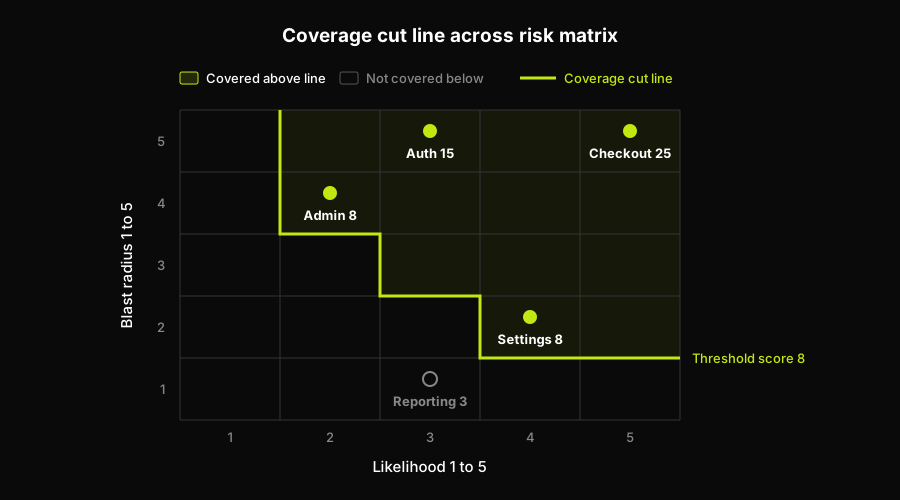
The same five areas plotted on the matrix. Checkout, auth, settings, and admin all sit at a score of 8 or higher and earn coverage; reporting at 3 falls below the cut line and waits until next quarter.
How Autonoma raises the affordable threshold
Look again at where the cut line landed in the table above. Reporting fell below it not because its risk score was zero, it wasn't, but because writing and maintaining a full end-to-end flow for it cost more engineer-weeks than the team had that quarter. Risk-based testing has always been triage forced by a coverage budget: the ranking is correct, the areas below the line are genuinely lower priority, and the reason a line exists at all is that authoring and keeping E2E coverage true costs real engineering time.
That's the constraint we built Autonoma to change. Our agents read the codebase directly, meaning routes, components, and the flows a user actually takes, then generate the test cases for an area and keep them current on every pull request instead of leaving that work for whoever touches the code next.
When generation and maintenance stop being the binding cost, the cut line doesn't disappear, it moves down the list. Reporting is the area that crosses it: a lower authoring cost is what brings a below-the-line area above it at all. Settings and admin don't cross the line, they were already above it, but they were under-covered relative to their scores, smoke-level for admin, partial for settings. A lower authoring cost lets their coverage depth catch up to their score.
Every test strategy allocates a scarce resource. It used to be the hours it took to write a test. Now it's the attention it takes to read what an agent produced and decide whether to trust it, and that review step doesn't shrink just because generation got cheaper. Someone on your team still reads the plan, still approves the diff, still owns the call. What changes is how far down your own risk-ranked list that review budget can reach, not whether ranking is still necessary.
Two boundaries worth naming honestly. First, this doesn't touch every area in your risk table: native mobile flows, load and performance testing, accessibility audits, API contract testing, and unit-level coverage all sit outside what an E2E agent does. Second, none of this changes what the model is for; it still tells you where to look first. We go deeper on what an AI-native testing strategy looks like end to end in our piece on E2E testing strategy for AI teams.
Where risk-based software testing breaks down
Every likelihood signal in this model is backward-looking. Change frequency, historical defect density, and time since a human last touched the path are all history, and a brand-new feature has none of it. Score it naively and a new feature comes in with "low likelihood" by default, because nothing has broken yet, and lands with the thinnest coverage in exactly the window where it's most likely to break: the first few weeks after ship, before anyone has exercised its edges.
The fix isn't to skip the axis for new surfaces, it's to substitute a different kind of signal for it. When there's no history, don't score likelihood from data. Score it from structure instead: how many integration surfaces the new code touches, how many engineers reviewed it before merge (a feature one person wrote and merged in a single pass is riskier than one three people reviewed line by line), whether it introduces a new data model or a migration, and whether it ships behind a flag with a small, controlled cohort.
New surfaces enter the model at a likelihood floor of 4 and get re-scored from real signals once they've run in production for a stated interval, typically one full release cycle.
The flag-gated case is the one legitimate discount: a feature exposed to a small slice of one segment behind a kill switch earns a lower starting score than the same feature shipped to everyone at once, because its blast radius is capped by the rollout itself, not because it's actually less likely to have bugs.
Two more limits are worth stating plainly instead of glossing over. The scores in risk-based software testing are judgment, calibrated by a team's own sense of its codebase, not a physical measurement, so they only mean something compared against each other inside one team's model. A risk score of 15 here isn't equivalent to a risk score of 15 anywhere else, and benchmarking them across companies is a category error. Felderer and Schieferdecker's taxonomy of risk-based testing, an arXiv paper, makes the same point more formally: risk assessment steers decisions across the test process, not just a ranking layered on top of it. And blast radius drifts as the product changes: a feature that used to touch one internal tool can end up touching every customer's data eighteen months later, quietly, without anyone updating the number. Re-score on a stated cadence, quarterly is reasonable for most teams, or the model keeps encoding a product that no longer exists.
Putting risk-based testing in your test strategy
The output of this model is one section of a document, not the whole document. It's the scope section: what gets tested at all, which is the input every later section depends on. That's the section a QA lead or engineering manager at a Series A through Series C company, already running a real suite and a real release cadence, gets asked to defend most often, and "we focus on high-risk areas" has never once satisfied that ask. If you're building that document from scratch, start from the copyable test plan template rather than a blank page, and see the E2E testing strategy for AI teams for how a behavioral scope fits alongside the rest of the taxonomy.
Keep the question this model answers separate from two it doesn't. This model decides whether a test exists for an area at all. It does not decide what order your suite runs in when the whole thing won't fit inside a CI window, that's test case prioritization, a genuinely different problem with its own techniques. And it does not decide whether a given test runs on this specific deploy, that's risk-based test selection: the same risk thinking applied per pull request, using signals like which files changed and how far the change reaches through your dependency graph. Existence, order, and per-deploy inclusion are three different questions, and conflating them is the fastest way to make a strategy document unreadable.
One more deliberate omission: nothing here tells you the pass-rate gate or the defect-density ceiling that decides when a suite is green enough to ship. Those are numeric thresholds, not risk scores, and they belong in entry and exit criteria, where they get the dedicated treatment they need.
Write the scoring table into your strategy document this week, even in rough form. A defensible ranking with five rows beats a vague sentence about "high-risk areas" every time an auditor, a new hire, or your own future self asks why one flow has full coverage and another has none. If authoring and maintaining that coverage is still the bottleneck once the ranking is right, that's the gap Autonoma closes. The ranking is still yours to do. What changes is how much of your own ranked list you can actually afford to act on.
Frequently Asked Questions
Risk-based testing is a strategy for deciding which parts of an application get automated test coverage by scoring the likelihood a feature fails against the blast radius if it does, then spending a limited coverage budget on the highest-scoring areas first. It decides whether a test exists for an area at all, not just what order tests run in.
Score likelihood and blast radius independently on the same scale, typically 1 to 5, then multiply the two numbers to get a risk score. Likelihood draws from change frequency, historical defect density, time since a human last exercised the path, and integration surface count. Blast radius draws from revenue exposure, data exposure, how many tenants a failure reaches, and how reversible it is. Multiplying rather than adding means a low score on either axis pulls the total down, so nothing scores high unless both the chance and the consequence are real.
Blast radius is how much damage a failure causes if it happens: whether it touches revenue, whether it exposes or mutates customer data, how many tenants or user segments it reaches, and how reversible the failure is. A bad render is low blast radius because it's obvious and fixable. A wrong charge or a leaked record is high blast radius because it isn't.
Risk-based testing decides whether a test should exist for an area at all, using likelihood and blast radius. Test prioritization assumes the tests already exist and decides what order they run in when the full suite won't fit inside a release window. They're sequential problems: score risk to build the suite, then prioritize to run it under a time constraint.
Don't score likelihood from data that doesn't exist yet. Substitute a structural proxy: how many integration surfaces the feature touches, how many engineers reviewed it, whether it introduces a new data model, and whether it's behind a flag with a small exposed cohort. New surfaces should enter the model at a likelihood floor rather than a naive low score, and get re-scored from real signals after a stated interval in production.
Risk-based testing draws its cut line with authoring cost, not with risk. An area can score high enough to deserve coverage and still lose the budget fight, because writing and maintaining an end-to-end flow for it costs engineer-weeks the team does not have that quarter. Autonoma targets that specific cost: its agents read the codebase directly, meaning routes, components, and the flows a user actually takes, generate the end-to-end cases for an area, and keep them current on every pull request instead of leaving the upkeep for whoever touches the code next. Cheaper per-area coverage does not change the ranking, it moves the cut line further down it. An area scored at 3 can finally earn coverage, and one scored at 8 that only ever got a smoke-level check can go deeper. The scoring itself stays a human judgment call, and work outside end-to-end scope, native mobile, load, accessibility, API contract, and unit-level coverage, still needs its own plan.
A worked example scores every area on both axes and multiplies them: checkout at 5 x 5 = 25 gets full end-to-end coverage including negative cases, while reporting at 3 x 1 = 3 gets no coverage this quarter. Auth, settings, and admin land in between, each with an allocation sized to its score rather than a gut feeling about which screen looks scariest.
Quarterly is a reasonable default for most teams. Blast radius in particular drifts as the product changes, a feature that used to touch one internal tool can end up touching every customer's data over time, without anyone updating the number. Re-scoring on a stated cadence keeps the model describing the product you actually ship instead of the one you shipped last year.


