

A test results dashboard is a view of test execution outcomes over time: run history, pass/fail status, flake clusters, slowest tests, and newly-failing suites, aggregated across CI runs so a team can tell which reds matter and which are noise. Unlike a single test report (a snapshot of one run), a dashboard exists to show trend: is this failure new, recurring, or getting worse.
Somebody on the team asks if the build is healthy. Someone else pulls up the dashboard. Forty test names, half of them red, no way to tell at a glance which ones failed last week too, which ones are new, and which ones are the same three tests that fail every Tuesday for reasons nobody has bothered to chase down. The dashboard exists. It is technically full of data. Nobody can read it.
This is the state most teams land in after wiring up CI output without thinking about what the dashboard needs to answer. Raw run logs and a pass/fail badge are not a signal, they are a pile of facts. A test results dashboard earns its keep only when it turns that pile into something a human can act on in under thirty seconds: what's new, what's recurring, and what's safe to ignore.
What a test results dashboard shows
A dashboard is not one view, it's several, and each one answers a different question. Run history alone tells you almost nothing without the views built on top of it.
| View | What it tells you |
|---|---|
| Run history | Every execution of the suite, in order, with pass/fail per run |
| Pass/fail rate | Overall health trend across a rolling window, not just the latest run |
| Flake clusters | Tests failing inconsistently across identical code, grouped together |
| Slowest tests | Which tests are dragging suite duration, and whether that's worsening |
| Newly-failing suites | What broke that wasn't broken yesterday, the highest-priority triage item |
| Failure grouping | Tests failing with the same error signature, often one root cause |
Run history is the raw material. Without it, every other view is a guess. A single red run tells you nothing about whether a test is broken or having a bad day. Ten runs of history tells you whether it's failed once or failed every time since Tuesday.
Pass/fail rate as a trend line, not a single number, is what separates a dashboard from a report. A report says "12 failed." A dashboard says "12 failed, same as last week, all in the same three suites." That second sentence is the one worth reading.
Newly-failing suites deserve their own view because they carry the most urgent signal in the dashboard. A test that has been red for two weeks is a known problem, probably already triaged or quarantined. A test that went red for the first time this run is either a real regression or a UI change nobody accounted for, and it needs eyes now, not next sprint.
Build vs buy a test results dashboard
Every team eventually asks whether to stitch together their own dashboard from CI output or adopt something purpose-built. The honest answer depends on how much of this you're willing to treat as a product, not a side project.
Building your own starts simple: JUnit XML or a JSON reporter from your test runner, a script that pushes results to a database after each CI run, and a chart on top. That gets you run history and pass/fail rate in an afternoon. Flake clustering is where the DIY path gets expensive. Detecting that five failures share a root cause, rather than being five unrelated breakages, requires grouping by error signature or stack trace similarity, and that logic has to be maintained as your test suite's failure modes change. Slowest-test tracking and trend detection add more surface area. None of it is hard in isolation. All of it together is a second product you now own and have to keep working.
Buying a dedicated tool (something in the Allure, ReportPortal, or Currents family, or a CI-native reporting layer) gets you flake detection, historical trend charts, and failure grouping out of the box, tested against thousands of other teams' edge cases instead of your own. The tradeoff is less control over what gets surfaced and how, and a subscription or hosting cost that a homegrown script doesn't carry. For teams under real time pressure, buying usually wins, because the maintenance cost of a homegrown dashboard tends to be paid in the exact sprint you can least afford it: the one where a release is already slipping and someone needs the flake cluster data five minutes ago.
The middle path, which most teams actually land on, is buying the aggregation and charting layer and building thin custom views on top for anything specific to your stack. That keeps the hard parts (flake detection, trend storage) off your plate while still letting the dashboard answer your team's specific questions.
If Autonoma is part of your testing stack, the dashboard question still matters. Autonoma is not the reporting dashboard; it changes the E2E signal feeding that dashboard by planning tests from the codebase, running them in live preview environments, reviewing failures, and updating affected tests when the code changes.
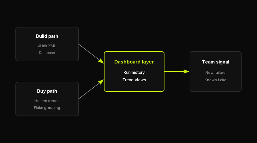
Build gives control, buy gives maintained flake detection. Most teams end up somewhere in between.
Reading the trends: flake clusters and UI-driven failures
This is where a dashboard either earns its place on your team's daily workflow or gets ignored after the second sprint. The views in the table above are only useful if someone knows how to read them, and the single most valuable read is distinguishing a real regression from noise.
A flake cluster is a group of tests failing inconsistently, not tied to a specific code change, often the same handful of tests recurring across runs. Spotting one is mostly pattern matching against history: does this test fail on some runs and pass on identical retries with no code change in between? If yes, it's flake, and the fix is investigating the test's stability (timing assumptions, shared state, network dependency), not the feature it covers.
A UI-driven failure cluster looks different once you know what to look for. Several tests across unrelated features start failing in the same run, all pointing at the same component or page. Nothing in the application logic changed. What changed is a selector, a layout shift, an element that moved or got renamed. This is the failure class that fills dashboards with red nobody can interpret: the tests aren't lying, exactly, they're reacting to a UI change as if it were a behavior change.
That distinction is the whole point of a trend view over a single report. A report from one run can't tell you a failure is new. A dashboard with run history can, and that's what lets a team triage in seconds instead of re-investigating from scratch every time.
Here's the part worth being honest about: most tooling stops at surfacing the cluster. A dashboard groups the red runs and shows you the pattern, but it doesn't remove the underlying cause. The tests that broke because a data-testid moved or a class name changed are still built on a locator that binds them to one snapshot of the UI. Every redesign, every refactor, produces the same class of noise again, and the dashboard just gets better at telling you it's happening. Fixing that class of noise for good takes regeneration, not another round of selector patching.
Autonoma approaches this a level up from locator healing. Its Planner agent reads the codebase to generate tests from actual behavior, not from a recorded snapshot of selectors. When the app changes, the Diffs Agent analyzes the code diff on the next PR and regenerates the affected tests, so there's no stale locator to detect or heal, because there's no locator binding the test to yesterday's DOM in the first place. The Executor runs the regenerated tests in a live preview, and the Reviewer classifies what comes back as a real bug, an agent error, or a plan mismatch, before it ever reaches your dashboard as an ambiguous red. The practical effect for the trend view: some UI-drift clusters move out of the dashboard because the affected tests are regenerated before they report as stale locator failures. What's left in the dashboard is closer to signal.
Acting on the signal
A dashboard that gets glanced at and closed is not doing its job. The value shows up in what the team does with each view, not in the view itself.
Triage newly-failing suites first, every time, before anything already known to be red. A test that broke in this run and not the last one is the highest-information item on the board. It's either a real regression that needs a fix before merge, or a UI change that needs the test updated, and either way it needs an answer today.
Quarantine flake clusters rather than letting them sit in the main view. Once a test is confirmed flaky (failing inconsistently with no code change behind it), move it to a non-blocking track where it still reports but doesn't hold up CI. Leaving it in the primary pass/fail view just trains the team to distrust red in general, which defeats the dashboard's purpose.
Watch the slowest-tests trend the way you'd watch a budget. A single slow test is a nuisance. A slowest-tests list that's been creeping upward for a month is a suite quietly becoming something nobody wants to run locally anymore, which is how teams end up only testing in CI and losing the fast feedback loop entirely.
Feed the UI-moved signal back into how the suite gets maintained, not just into today's triage. If a flake cluster or a newly-failing group traces back to a UI change rather than a behavior change, that's a data point about how much of your maintenance burden is drift-driven versus bug-driven. Teams that track this ratio over a few sprints usually find UI drift accounts for more of their red runs than actual regressions, which is the strongest argument for regenerating tests from the app itself rather than re-recording or manually patching selectors every time the UI moves.
For teams using Autonoma, this feedback loop moves upstream. The dashboard still shows the trend, but the Diffs Agent handles the maintenance work that used to create repeated UI-drift clusters, so the team spends less time reading the same stale red pattern and more time on newly-failing behavior that needs a product or code fix.
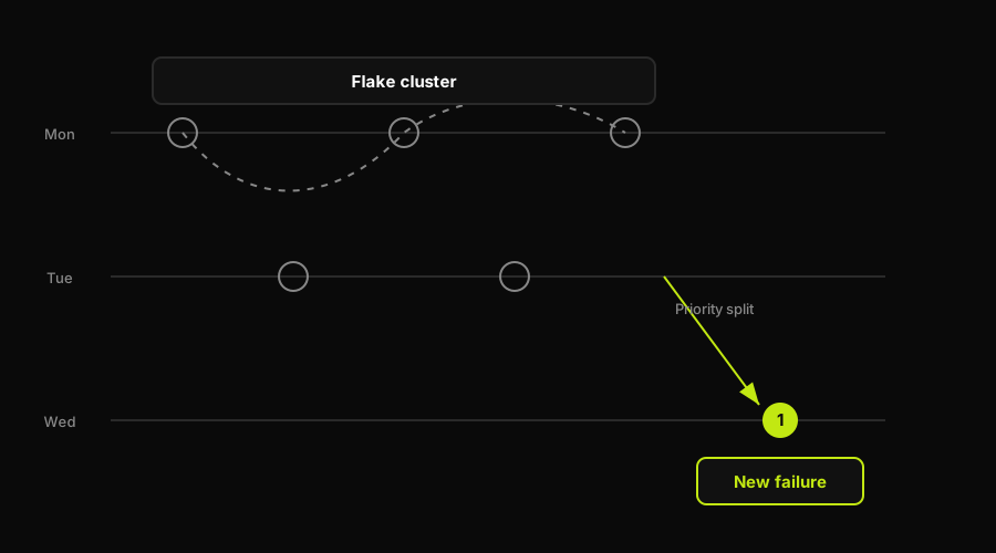
A flake cluster and a single new failure carry different urgency. Reading the pattern is the dashboard's real job.
For the broader operational view (pass rate, flake rate, coverage, MTTR, escaped defects) that this dashboard feeds into, see the QA metrics dashboard breakdown. If you're still deciding how results get out of CI and into a dashboard in the first place, automated test reporting covers the pipeline side of that problem, and the test reporting tools comparison covers the current tool landscape.
FAQ
A test results dashboard is a view of test execution outcomes over time, showing run history, pass/fail trends, flake clusters, slowest tests, and newly-failing suites. It differs from a single test report by aggregating results across many runs so a team can see whether a failure is new, recurring, or worsening, rather than just whether the latest run passed.
Building a test results dashboard requires three pieces: structured output from your test runner (JUnit XML or a JSON reporter), a place to persist results after every CI run (a database or object store, keyed by a run identifier), and a visualization layer on top for trend charts, flake grouping, and run history. The straightforward views (run history, pass/fail rate) are quick to build. Flake clustering and failure grouping by error signature are the parts that take ongoing maintenance, which is why many teams buy a dedicated reporting tool for that layer instead of building it from scratch.
A flaky test shows an inconsistent pattern in run history: it fails on some runs and passes on others with no code change in between. On a dashboard, this shows up as a test appearing in a flake cluster rather than a clean pass or clean fail streak. The tell is retrying the same commit and getting a different result. Tests confirmed flaky should be quarantined into a non-blocking track so they stop diluting trust in the primary pass/fail view.
A test report is a snapshot of a single run: which tests passed, which failed, how long it took. A dashboard aggregates many runs over time, adding trend views like run history, flake clusters, and newly-failing suites that a single report can't show. A report answers 'what happened in this run.' A dashboard answers 'is this getting better or worse, and is this failure new.'
Look at whether the failing tests cluster around a single component or page across otherwise-unrelated test cases, with no corresponding change in application logic. That pattern usually means a selector, layout, or element moved, and the tests are reacting to the UI shifting rather than a real behavior regression. A true regression tends to show up in tests tied to the specific feature that changed, not scattered across a shared UI element. Tests generated from the app's actual behavior and regenerated when the UI changes remove this ambiguity at the source, since there's no stale locator producing the false signal in the first place.


